Mobile-First Design: Creating Exceptional Shopify Experiences for the Small Screen
Mobile commerce is no longer the future—it’s the present. With over 70% of eCommerce traffic now coming from mobile devices and mobile sales accounting for more than half of online transactions, creating exceptional mobile shopping experiences has become essential for eCommerce success.
Yet many Shopify merchants still treat mobile as an afterthought, designing primarily for desktop and then adapting for smaller screens. This approach often results in compromised mobile experiences that fail to convert browsers into buyers. In this article, we’ll explore why mobile-first design is critical and how to implement it effectively on your Shopify store.
Why Mobile-First Matters for Shopify Stores

Core Principles of Mobile-First Design
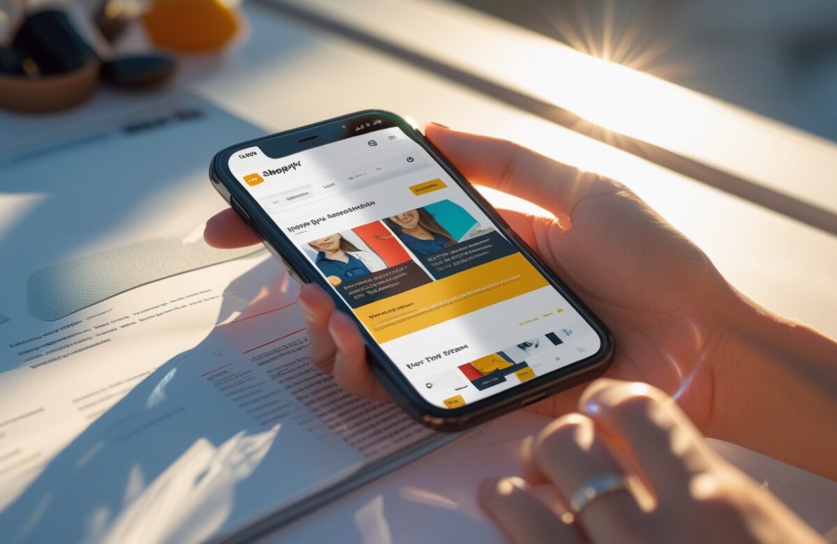
Selecting a Mobile-Optimized Shopify Theme
Optimizing Product Pages for Mobile Conversion
Mobile Navigation Best Practices
Mobile Checkout Optimization
Performance Optimization for Mobile
Testing and Optimization Strategies
Conclusion
Mobile-first design is no longer optional for Shopify merchants—it’s a business imperative. With the majority of eCommerce traffic and an increasing share of transactions happening on mobile devices, creating exceptional small-screen experiences directly impacts your bottom line.
By embracing mobile-first principles, selecting the right theme foundation, and implementing the optimization strategies outlined in this article, you can create a Shopify store that not only works well on mobile but truly excels. This approach will result in higher conversion rates, improved customer satisfaction, and a competitive advantage in an increasingly mobile-centric market.
Remember that mobile optimization is an ongoing journey rather than a destination. Continue to test, learn, and refine your mobile experience based on user behavior and emerging best practices. The merchants who prioritize mobile excellence today will be best positioned for eCommerce success tomorrow.